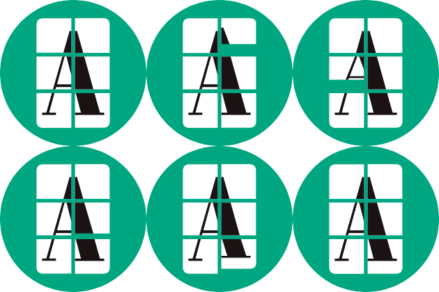
When you create a company, the brand mark typically becomes sacrosanct. Marketing teams cringe if creatives in the organization suggest changes to the globally recognized mark. Not so at Artifcts. (Have you seen our holiday logo?)
We reached out to Brooke Robinson, founder and creative director at Goodtype (and fellow Austin-cycling enthusiast), to tap into the global network of lettering artists to illustrate the letter 'A' for Artifcts in celebration of today's one-year anniversary of the incorporation of Artifcts. And why not? We are striving to turn the nature of online communities today as well as our entire relationship with 'stuff' on its head. So, what's a little playfulness with our company's 'A' to celebrate a major milestone?
The Goodtype Competition
During early December, dozens of artists from around the world—Brazil, Guatemala, Indonesia, and the UK, among other countries—offered their versions of the letter 'A,' which in screenshot form alone is a work of art!
 View all the GoodtypeXArtifcts contest entries here over on Instagram.
After probably too many hours debating, we selected three winners, each of which offered a wholly original and captivating 'A' design. We eagerly anticipate putting these into play as well as seeing what these artists will each Artifct first with their new Artifcts accounts. We will share the Artifcted version of each of the winning 'A's here soon so you can learn more about the artist, the technique, inspiration, and more.
Now, the winning designs!
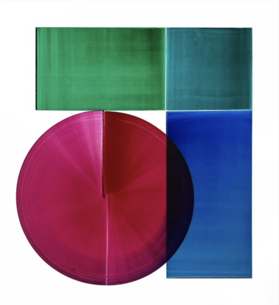
The first place design is a vibrant and original work from artist Saber Javanmard (@studio.saber). Made with silkscreen ink on paper, you can pop over to the Artifct to watch the bonus demonstration video to see how he creates these designs. Even though it's a lowercase 'a' (compared to the uppercase Artifcts 'A'), we think it will be at home here at Artifcts. Since we just rolled out video and audio features for Artifcts last week, we are looking forward to Artifcting this 'A' along with its original production on video! 
The second place design is from Julio (@tenixvermelho) of Brazil. His foliage covered letter-press style 'A' is a distinctive style that we enjoyed for its modern play on traditional designs. Julio plans to Artifct all of the drawings his kids have made of their family.
Last but not least, the third place design was created by illustrator and teacher Chris Piascik (@chrispiascik), who if you have spent any time on his Instagram profile, you'll know loves to keep you guessing as to what creative offspring's next! His whacky monster 'A' really should make an appearance next Halloween, wouldn't you agree?
The Future of Artifcts and the Lettering Community
We hope it's bright! We want to support and stay connected with local designers for playful marketing campaigns, swag, and other creative initiatives you'll see from Artifcts. To this end, we also have new community outreach planned with young artists we will share here in late spring. Stay tuned, and happy Artifcting!
###
© 2021 Artifcts, Inc. All Rights Reserved.


