Heather Nickerson, Founder and CEO of Artifcts, recently joined a podcast conversation with LegacyTree Genealogists to explore how the objects in our lives carry meaning far beyond their physical form. In the episode, Heather shares insights into why preserving the stories behind belongings can help families strengthen connections, prepare for life transitions, and ensure meaningful legacies are passed down across generations.
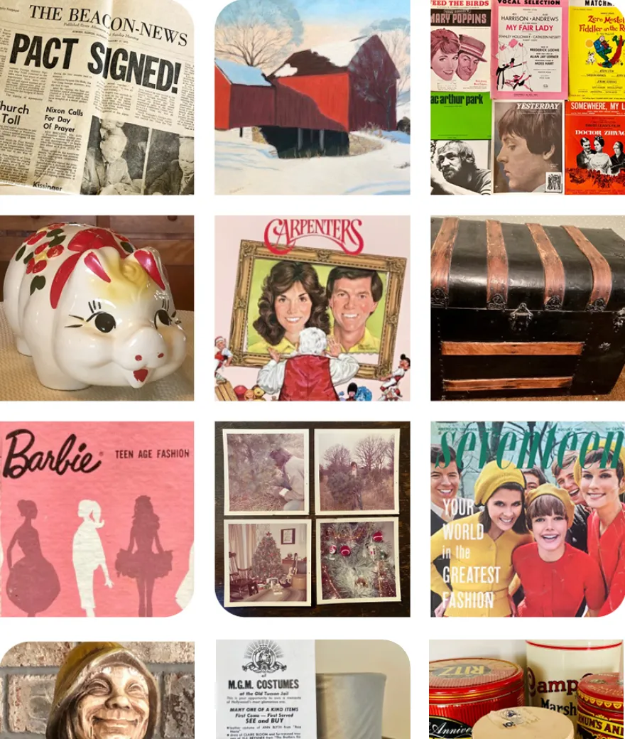
During the conversation, Heather explains how many families inherit possessions without understanding the history or emotional significance behind them. Without those stories, treasured items can lose their meaning or become sources of confusion during estate planning and downsizing. Tools like Artifcts help bridge that gap by allowing people to document the memories, context, and intentions tied to their belongings.
Drawing from both personal experience and her work building Artifcts, Heather emphasizes the importance of capturing stories before they are lost. Her own inspiration for creating the platform came after the unexpected passing of her mother, when she realized she had inherited many items—but not the stories behind them. Click here to listen to the conversation.
Key Insights from the conversation include:
-
Start with meaning, not inventory. The most valuable part of an item is often the story behind it.
-
Preserve context for future generations. Photos, videos, and written memories help families understand why objects matter.
-
Make legacy planning more approachable. Even small steps toward documenting belongings can reduce stress for loved ones later.
Through conversations like this podcast appearance, Heather continues to highlight the broader mission of Artifcts: helping people capture the memories, value, and meaning behind the things that shape our lives.
As families increasingly seek ways to organize belongings, declutter thoughtfully, and prepare for the future, the ability to document the story behind “stuff” has become an essential part of preserving personal history and family legacy.
###
© 2026 Artifcts, Inc. All Rights Reserved.
